

Gretchen Albrecht: Curves of Enclosure
Painter Gretchen Albrecht is a master of colour and form. Blazing with energy, her canvases hover somewhere between a tactile present and a sensory infinite, nodding to the past while striving innovatively toward the future.
Words: Laurence Simmons
Photography: Frank Schwere
Gretchen Albrecht was born in the predominantly working-class suburb of Onehunga in Auckland, New Zealand in 1943. In 1991 she described her childhood to her friend, writer Linda Gill. It was, she said: “a secure powerful childhood. Clean water, open air, sandy holidays at the beach … confidently anchored in popular culture.” After graduating from Elam School of Fine Arts in 1963 she began her painting career by producing figurative imagery and worked as an art teacher in schools.
Her father, the son of Catholic and Protestant (Irish and German/Dutch) immigrants from South Africa, was a builder and took her as a child to his building sites. He imparted to her a love of shape and structural design; indeed, he made all her shaped wooden stretchers up until his death in 1996. Her mother, descended from a grain merchant family that had arrived early in settler New Zealand in 1840, was an accomplished seamstress and gave Albrecht, one suspects, a love of clothes, colour and the preparation of food. “It was a childhood rich in sensory, tactile experience,” she says. Throughout her painting life, aesthetic pleasure in the frictions of colours, the point at which enjoyment sputters into the sublime and the direct experience of nature are all delights she has rejoiced in, establishing herself as one of New Zealand’s most revered senior abstract painters.
In the late 1970s the rising generation of New Zealand artists assimilated abstract expressionism, picking up the momentum of Americans in mid- stride. The attraction was the abstract expressionists’ belief in (their) art’s access to invisible reality. Albrecht’s first mature works starting in the 1970s were poured acrylic stained abstractions of sunset landscapes. Colour-field paintings such as these were heralded as the next best thing after abstract expressionism, paint often poured dead flat they eschewed a hard-edged line, yet were redolent of landscape. Albrecht’s source has commonly – and perhaps mistakenly – been identified as Helen Fran- kenthaler, but she has declared in interviews that the work of Morris Louis was a more formative stimulus. In particular his Unfurled paintings, which she saw exhibited at the Auckland City Art Gallery in 1971, where raw canvas duck was layered with broad runs of acrylic that coursed with gravitas in downward and inward channels. Acrylics, then a new medium in vogue, provided Albrecht with a palette of colours tending to the floricultural: smouldering orange, raspberry-red, parsley-green, plum, together with sun yellow and sky blue.
In crowded overlapping pourings they gave her compositions a flooded look; drooping cloud bellies evocative of the all-engulfing weather fronts that scud onto New Zealand’s West coast from the Tasman Sea. Evoked too are the cliffs and empty black sand beaches of Auckland’s Waitakere Ranges (Piha Karekare), Whatipu where the setting sun layers intense colours and rain advances in grey sheets. “I have always thought of myself as an abstract landscape painter,” Albrecht admits. Take Cloud over Whatipu (1976), a swarm of piquant, fugitive notes falling like spontaneously dropped sheets of paper, each cradled element has a hovering yet sagging weight achieved by the relative densities and contrasts of colour, diaphanous but intensely built up. Albrecht can make tinges of pink seem to exude a heavy brooding presence and cause a normally ominous purple-black to levitate. The lightness, delicacy and poetry of these poured forms was on Albrecht’s part, perhaps, a conscious reaction to the lurid, masculine styles of – in the New Zealand context – more expressionist painters.
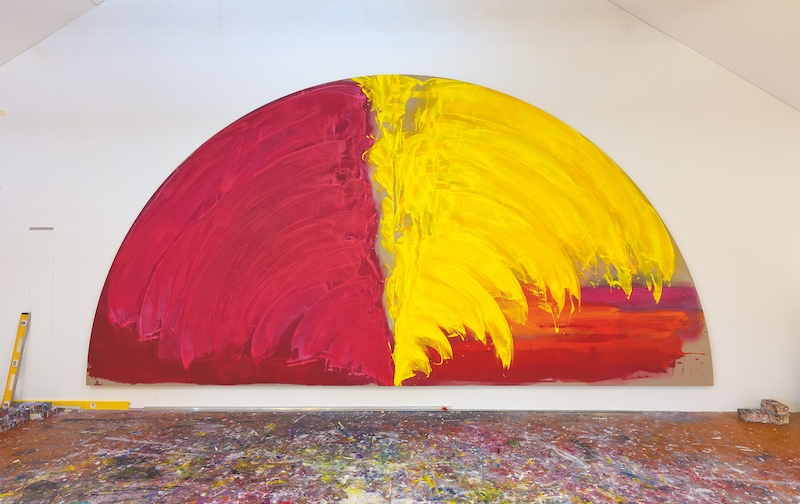
Throughout the 1980s Albrecht fashioned shaped canvas forms – hemispheres and ovals – that she then worked on with arcing brushstrokes of often vibrant colour. Albrecht created her first hemisphere paintings in 1981. Like the large landscapes of the 1970s, the hemispheres were floor works, first produced on the studio boards during a year-long Frances Hodgkins residency in Dunedin. Initially each hemisphere was composed of two stretched canvases made into quadrants and bolted together, later she employed a full hemispherical stretcher. Working in acrylics, Albrecht applied paint directly onto the canvas, allowing the pigment to seep into the fabric, building up rich layers of colour in wide sweeping movements. The first canvases were the width of her arm span. She has described the dis- tinctive hemisphere as “a shape I could put my voice into”.
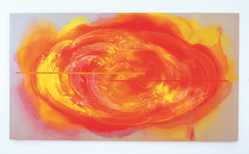
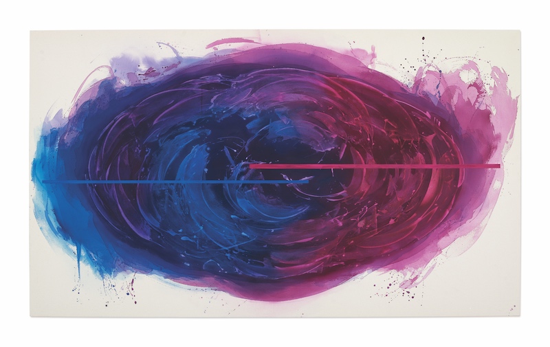
The hemisphere paintings vary from bright to crepuscular in tone, from crisply limned to illegibly blurred, and in texture from creamy to black sandy grit. They feel monumental in part because of the objectness of their support. The hemisphere form was succeeded by the oval, a geometric form that also assisted the swirled pleasures of the brushed and squeegeed colour. Albrecht’s robust washes of acrylic were now superimposed with horizontal bands of oil paint mixed with wax. In Claritas (blind angel) (2001), circular white acrylic wisps are overlaid with centred horizontal strips of white and black that stand out geometrically, declaring a distinct wariness of the arbitrary.
Albrecht’s inspirations since 2009 have been large rectangular canvases of Belgian linen centred with oval-shaped vortices of colour, more deliberate in their execution, with simpler colours firmly scaled to the canvas. In The Fire and the Rose Revisited (2013), adagio loops and wristy flares stake out the sensuous, brown-bread, Belgian linen ground to hang in space as passages of music in the air. Spills of pulsating acrylic paint edge their way beyond the confines of the oval form. Like the tantric art Albrecht has recently become interested in, you see exactly what the shape is, even as, with patient looking, you undergo a gradual, then sudden, soft detonation of beauty.
It was a 13-month trip abroad to America and Europe in the late 1970s when Albrecht was 35 that provided the catalyst for the hemispheres that were to define her oeuvre for the next 20 years. Albrecht has always been acutely alert to art histories and cultures other than her own. For over 35 years since that first excursion she has been a inveterate traveller on art pilgrimages and she communes directly with past painters of similar temperaments:
Piero della Francesca, Fra Angelico, Frances Hodgkins, Henri Matisse, Mark Rothko, Cy Twombly, Agnes Martin. Albrecht is also engaged in an earnest attempt to advance her own practice through an engagement with painting’s past. Each canvas contains a spirit that has allowed Albrecht to enter an art historical dialogue with painting, through painting. Albrecht has written moving- ly of seeing della Francesca’s Madonna del parto in the cemetery chapel in Monterchi. In a painting like Pacific Annunciation (1983) she does not relive della Francesca’s heroic moment nor does she crit- icise it. She uses it to generate new work. It is this unfashionable approach – one that speaks of the spiritual heritage within abstraction yet lies outside the reductive modes of irony and nostalgia – that is worth considering. The most helpful piece of writing on Albrecht that I know is Francis Pound’s description of his realisation that under the curved compositions and ripples of squeegeed paint lay a palimpsestic modernist grid which then lead to his subsequent discovery: “What is specific to Albrecht’s variant of the grid, and to its historical moment, is precisely its deviation.”
To say, as many have done, that Albrecht is a supreme colourist is to state the obvious. Only look at the bursting luxuriance of In a shower of gold (2011). Or the triumph of vibrant crimson butted up to dark electric blue in Penumbra (1983). Colour breathes lyrical urgency. Her canvas blazes with cumulative energy. Colour in an Albrecht painting is both in your face, brilliantly bright, but also a metaphor for interiority – the space of hidden meanings – as light hits the canvas surface it exposes what is inside and underneath, revealing a kind of writing in the dark. Colour works hard for Albrecht. Her hues tend towards the organic: greens, blues, yellows, reds. But in her meditations on death and mourning she has also employed an unabridged dictionary of blacks. Unlike the impersonal work of the minimalists, Albrecht’s painting is unabashedly emotional and the handmade quality of her paintings is deliberately emphasised, their size also revealing the physical activity involved in doing them. We sense always the sweep of her painting hand across the canvas surface. Her colour is not programmatic but intuitively chosen, and laid on in highly visible strokes made by a paperhanger’s brush. Worked over and over, the colours deliberately reveal their underpainting and have an immediacy that appeals to the tactile sense as well as the emotions.
Albrecht finds her colour by working the surface so that the chromatic character and luminosity are inseparable from its texture. As we gaze into this light we are confronted by floating, celestial forms whose blurred edges resonate in a disembodying spatiality. They imply the infinite as they hover between presence and absence – physical body and body of light. This is a mysterious position, one of spirituality without dogma, open to interpretation and judgment.
GRETCHEN ALBRECHT, COLLOQUY, SHOWS AT TWO ROOMS GALLERY IN AUCKLAND FROM 10 JULY TO 8 AUGUST 2015.
MARY KISLER
Curator, Auckland Art Gallery
Gretchen Albrecht’s paintings are known for their exploration of colour and form. Curator at the Auckland Art Gallery, Mary Kisler, highlights this as one of the artist’s greatest strengths. “Gretchen’s painting takes the modernist exploration of colour and form and moves it to new contemporary levels. The forms on which she paints and the way in which paint is worked within the hemispheres, ovals and rectangular canvases are almost kinaesthetic – the paint carried by the movement of her body, the span of her arm. Her work is significant in many ways, redolent with meaning and deeply satisfying; an exploration of what colour can do and what it can mean. Acutely aware of the historical considerations that have challenged painters since Giotto claimed human experience as a valid subject for art, her paintings are polyvalent, layered with meanings, yet individually rich unto themselves.” While highlighting In a Shower of Gold and Moon- light as particularly strong pieces, Kisler admits it’s impossible to choose just one work as superior. With work deeply connected to the New Zealand landscape, Albrecht reflects on her own personal experiences and observations throughout her work while still maintaining a universal appeal and overall sensory experience. “Hers are paintings that you can sink into, become absorbed in, constantly suggesting new sensations and meanings to the individual viewer. What I admire about Gretchen is her constant striving. Her most recent works both refer to the past and move in new directions – what every artist should be seeking to do.”
Naomi Gall
JENNY TODD
Director, Two Rooms Gallery
With a career spanning some five decades, Gretchen Albrecht has cemented her place as one of New Zealand’s most well-respected artists. Her upcoming exhibition, Colloquy, at Two Rooms Gallery in July this year will launch a new monograph of her work, also called Colloquy. With a portfolio that ranges from works on paper to larger canvases, prices of Albrecht’s work can range from $5,000 to $200,000 according to Two Rooms director Jenny Todd. The artist is known for her rich use of colour in her paintings and it is these works that have always inspired a demand amongst New Zealand collectors. However, according to Todd: “there is a renewed interest in her early stained canvases from the 1970s with these works now fetching very high prices.” These early works are now quite rare which could account for their desirability. Also, Todd comments, these pieces “have a timeless quality and address contemporary painting concerns of materiality, process and colour”. It is not just among collectors where a demand can be seen, with one of the artist’s major works, In a Shower of Gold (2011), recently purchased by the Museum Of New Zealand, Te Papa, Tongarewa for their national art collection. Her work is also held in the collections of the Art Gallery of New South Wales and the Newcastle Art Gallery in Australia.
Naomi Gall
This article was originally published in Art Collector issue 73, JUL – SEP 2015.
FOLLOW THIS ARTIST
READ MORE
 https://artcollector.net.au/wp-content/uploads/2024/04/21A5554.jpg
1200
1200
Erin Irwin
https://artcollector.net.au/wp-content/uploads/2021/11/Art-Collector-logos-transparency-WHITE-1080x1080px-2.png
Erin Irwin2024-04-15 01:59:432024-04-15 02:04:47Artist Profile: Abdullah M. I. Syed
https://artcollector.net.au/wp-content/uploads/2024/04/21A5554.jpg
1200
1200
Erin Irwin
https://artcollector.net.au/wp-content/uploads/2021/11/Art-Collector-logos-transparency-WHITE-1080x1080px-2.png
Erin Irwin2024-04-15 01:59:432024-04-15 02:04:47Artist Profile: Abdullah M. I. Syed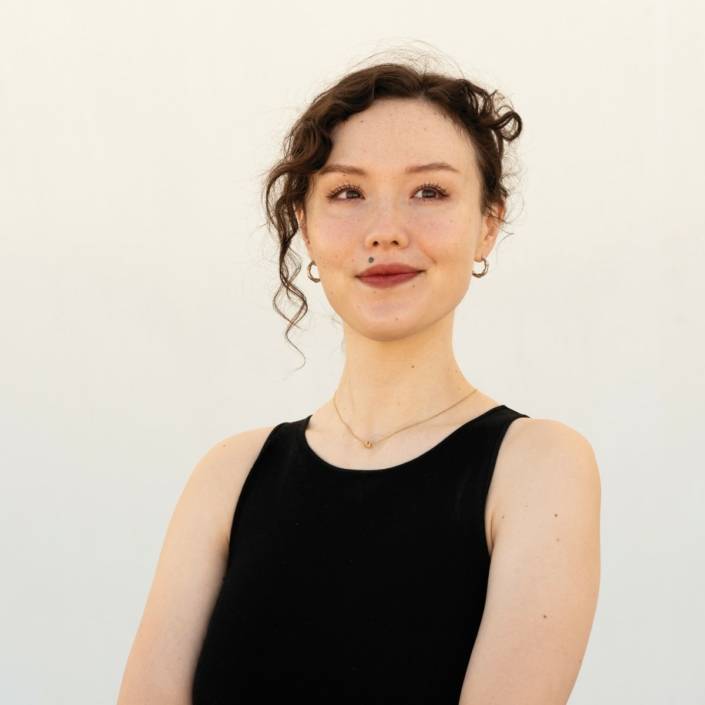 https://artcollector.net.au/wp-content/uploads/2024/04/AikoRobinson_AC_AaronClaringbold.jpg
1200
1200
Erin Irwin
https://artcollector.net.au/wp-content/uploads/2021/11/Art-Collector-logos-transparency-WHITE-1080x1080px-2.png
Erin Irwin2024-04-15 01:17:462024-04-15 01:58:32Artist Profile: Aiko Robinson
https://artcollector.net.au/wp-content/uploads/2024/04/AikoRobinson_AC_AaronClaringbold.jpg
1200
1200
Erin Irwin
https://artcollector.net.au/wp-content/uploads/2021/11/Art-Collector-logos-transparency-WHITE-1080x1080px-2.png
Erin Irwin2024-04-15 01:17:462024-04-15 01:58:32Artist Profile: Aiko Robinson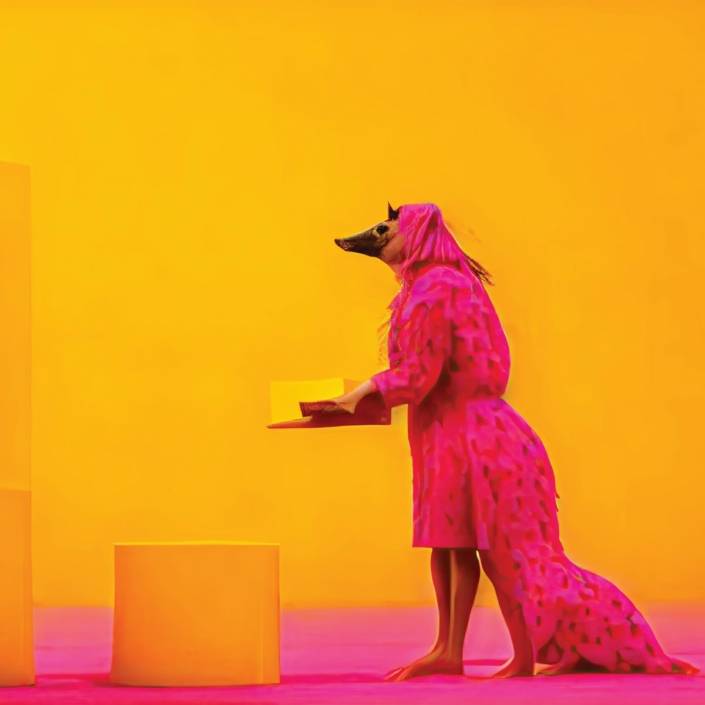 https://artcollector.net.au/wp-content/uploads/2024/04/BrieTRENERRY003.jpg
1200
1200
Erin Irwin
https://artcollector.net.au/wp-content/uploads/2021/11/Art-Collector-logos-transparency-WHITE-1080x1080px-2.png
Erin Irwin2024-04-03 08:26:292024-04-03 08:28:54Artist Profile: Brie Trenerry
https://artcollector.net.au/wp-content/uploads/2024/04/BrieTRENERRY003.jpg
1200
1200
Erin Irwin
https://artcollector.net.au/wp-content/uploads/2021/11/Art-Collector-logos-transparency-WHITE-1080x1080px-2.png
Erin Irwin2024-04-03 08:26:292024-04-03 08:28:54Artist Profile: Brie Trenerry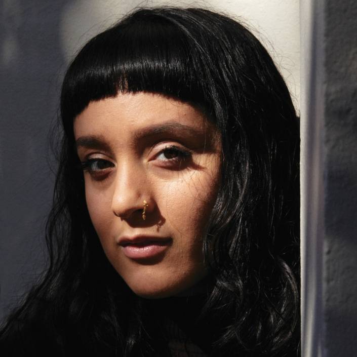 https://artcollector.net.au/wp-content/uploads/2024/04/ex.230820_ARTCOLLECTOR__049.jpg
1200
1200
Erin Irwin
https://artcollector.net.au/wp-content/uploads/2021/11/Art-Collector-logos-transparency-WHITE-1080x1080px-2.png
Erin Irwin2024-04-03 07:58:392024-04-03 07:58:39Artist Profile: Monica Rani Rudhar
https://artcollector.net.au/wp-content/uploads/2024/04/ex.230820_ARTCOLLECTOR__049.jpg
1200
1200
Erin Irwin
https://artcollector.net.au/wp-content/uploads/2021/11/Art-Collector-logos-transparency-WHITE-1080x1080px-2.png
Erin Irwin2024-04-03 07:58:392024-04-03 07:58:39Artist Profile: Monica Rani Rudhar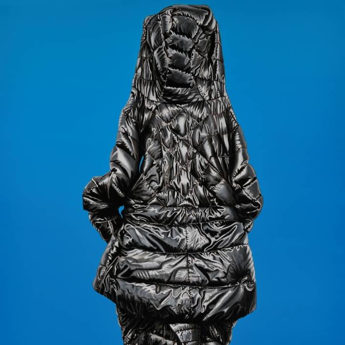 https://artcollector.net.au/wp-content/uploads/2024/04/Jan-Murray-Figurine-blue-2023-oil-on-linen-Copy.jpg
2346
2346
Erin Irwin
https://artcollector.net.au/wp-content/uploads/2021/11/Art-Collector-logos-transparency-WHITE-1080x1080px-2.png
Erin Irwin2024-04-03 07:34:162024-04-03 07:34:16Artist Profile: Jan Murray
https://artcollector.net.au/wp-content/uploads/2024/04/Jan-Murray-Figurine-blue-2023-oil-on-linen-Copy.jpg
2346
2346
Erin Irwin
https://artcollector.net.au/wp-content/uploads/2021/11/Art-Collector-logos-transparency-WHITE-1080x1080px-2.png
Erin Irwin2024-04-03 07:34:162024-04-03 07:34:16Artist Profile: Jan Murray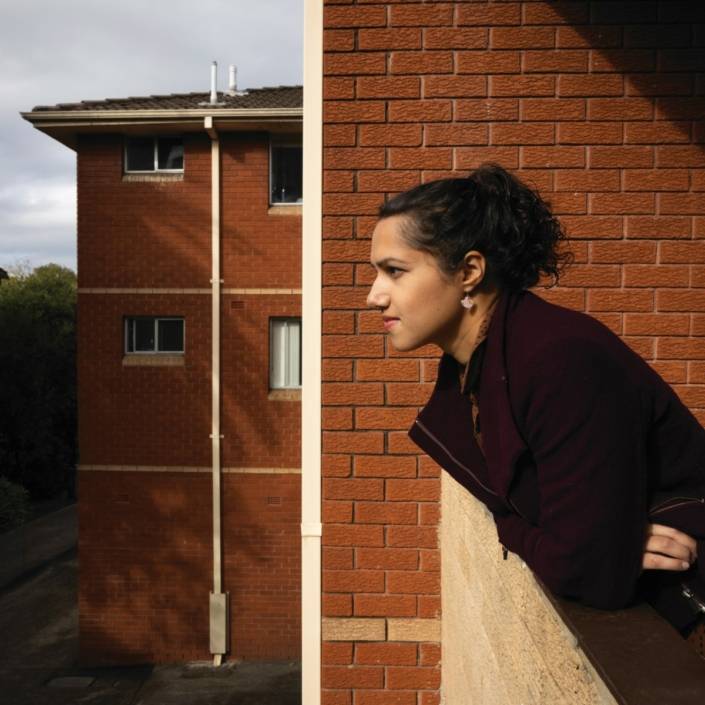 https://artcollector.net.au/wp-content/uploads/2024/04/21A4337-copy.jpg
1200
1200
Erin Irwin
https://artcollector.net.au/wp-content/uploads/2021/11/Art-Collector-logos-transparency-WHITE-1080x1080px-2.png
Erin Irwin2024-04-03 07:01:572024-04-03 07:01:57Artist Profile: Kirtika Kain
https://artcollector.net.au/wp-content/uploads/2024/04/21A4337-copy.jpg
1200
1200
Erin Irwin
https://artcollector.net.au/wp-content/uploads/2021/11/Art-Collector-logos-transparency-WHITE-1080x1080px-2.png
Erin Irwin2024-04-03 07:01:572024-04-03 07:01:57Artist Profile: Kirtika Kain


