

Jonny Niesche: The Art of Seduction
Jonny Niesche’s eternal search for ways to heighten the materiality and dynamism of his practice led him away from oil on linen, via glitter, towards something entirely experimental.
Words: Jacqueline Millner
Photography: Nick De Lorenzo
BEAUTY, HUMOUR, ERUDITION. Light, space, body. Jonny Niesche’s work has got it all. With painting-like prints and drawing-like sculptures evoked in finely calibrated and gently enveloping configurations, Niesche creates seductive environments that glow with sensuality and unmoor us from familiar ground.
Niesche confesses that from a young age he was beguiled by “beauty products”: makeup and its heady consumer display. Perhaps it was their promise of transformation, or their taboo gendered associations, but this also speaks to the proto-artist’s sensitivity to the thoughtful placement of colour, texture, and scent which would later find expression in his art practice.
And it hints at an early intuition of the carnality and emotion at the heart of that loftiest of things, the aesthetic experience. Makeup does not only comprise of mouth-watering tablets of possibility akin to colour-charts; it is designed for the body, in particular for the skin, to adorn, enhance or conceal. Whether chemical cyan or organic plum, such pigments are destined to blend with flesh, to saturate, permeate, bleed… what Niesche aspires to in his signature paintings. For contrary to common perceptions neither skin nor adornment are superficial: as one of Niesche’s favourite writers Michel Serres reminds us, “Nothing goes as deep as decoration, nothing goes further than the skin, ornamentation is as vast as the world”.
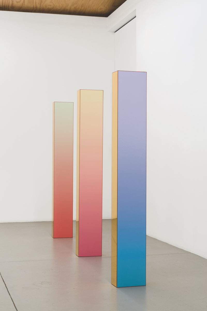
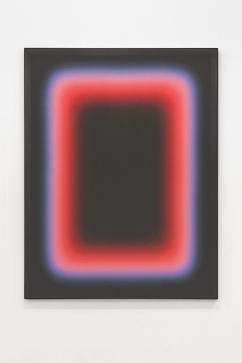
Niesche’s search for ways to heighten the materiality, dynamism and interactive qualities of his paintings led him away from oil on linen, via glitter, towards experimental processes and materials. One source of inspiration was a large used silkscreen frame which, when stood on its end, revealed traces of the many images that had passed through its fine grain, layered with the shadows of real time movement in its immediate vicinity. Niesche sought to creatively reproduce but control these effects, before hitting on a unique process involving heat, ink and diaphanous fabrics.
Dye sublimation printing is so called because as the dye infuses the textile it transitions from solid to gas without going through a liquid phase. Yet the term is curiously apt for Niesche’s practice, both in relaying the transformative energy in his works, and in evoking the psychoanalytic phenomenon whereby libidinous energy is diverted from its immediate goal to a socially more acceptable use, such as art.
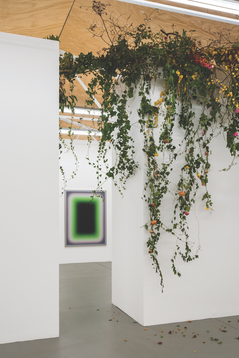
These beautifully crafted objects, layers of lusciously coloured voile on polished brass and mirror, deliver waves of aesthetic pleasure. Voile, traditionally used for wedding veils, conjures romantic puffery with serious intent, including to conceal. It also brings to mind Serres’ metaphor for knowledge as a knotting together of veils, rather than as a gesture of uncovering or laying bare that underpins much modernist abstraction and its search for the essential.
Niesche’s palette selection also emerges at the intersection of desire, transformation and body, with music and design key sources. For several years, Niesche looked to the album covers, makeup and hair of idols such as David Bowie and Debbie Harry, distilling their genre-bending cool into digitally generated colour gradients. A recent series paid homage to the latest range by Belgian fashion designer Dries van Noten – renowned for his sumptuous style and unexpected colour juxtapositions – by extracting its distinctive tonal range, itself inspired by the flowers in his garden. Another series entailed sculptural experiments with chameleon-like ChromaFlair autopaint, which switches from one tone to another in response to the viewer’s movement. Through these aesthetic choices, Niesche mobilises aesthetics in its many forms while also demonstrating his erudition, which stretches well beyond the modernist repository of minimalism, colour field and op art. His works are rich with references that invite conceptual and sensory engagement, including the delight that comes with realising that what might appear at first to be a rigorous formal abstraction is in fact a tribute to the kooky musician-cum-artist Captain Beefheart.
Indeed, playfully involving his audience is central to Niesche’s practice which is driven less by rarefied studio research than by a desire to be in the world, among real bodies and diverse intelligences. Increasingly, the artist has experimented with reflective materials that literally catch the viewer in the process of looking, and with architectural approaches, that physically immerse the viewer in a holistic environment. Recent works include spinning mobiles and mirror-sided sculptural paintings which stand in the middle of the gallery, their reflections serving to integrate wall works, viewer, floor and ceiling in a continuous relay of images and perspectives. This affirmation of the power of the viewer and their physical presence renders the artwork less an object than an encounter, mingling bodies, light and space, again referencing Serres and his interest in unsettling the distinction between subject (us) and object (them). By reminding us of the importance of “being there”, Niesche’s work strikes a particularly poignant note in these times of plague that have rendered co-presence and touch taboo.
“I had a slow introduction to Jonny’s work, encountering individual works in a range of group exhibitions including the NSW Emerging Artist Fellowship exhibitions at Artspace. His work stood out in these contexts: his deep engagement with modernist histories of minimalism, abstraction and kinetic art were seemingly distinct from the more overtly socially engaged work taking place around it.”
“Jonny is not alone in pursuing and extending these traditions within the context of an image conscious digitally mediated capitalist society. The techniques and allure of his objects and surfaces – of his finishes – create work that is at once seductive but also disturbing and physically discombobulating in an intense sensory play between work, physical environment and the viewer.”
“An encounter with Jonny’s work highlights the way in which acts of perception are always embodied and located. He obviously works with an awareness of the rich legacy of mirrored surface and structure in 20th and 21st century art. Physically animating the mirror in a way that is considered, graceful and yet largely uncontrolled by the artist has been a standout action in his work.”
“I’ve had the pleasure of encountering Jonny’s work often over the years and each time I am struck by the effect it has on me. Yes, they’re incredibly visual, beautifully realised, complex and conceptually strong, but what really draws me to Jonny’s work is seeing the subtle yet relentless progression he’s made across different media. He’s constantly refining and challenging himself and I think this is crucial to the longevity of an artist’s practice.”
“I think Jonny’s works are perfectly priced given the very strong demand we have for them. It’s always a challenge for us as a gallery to introduce a new artist’s work to our audience, but Jonny is at an exciting point in his career, and I think he’s making some of his best work yet. His recent STATION show is testament to this.”
“His work is heavily sort after, so we’re in a position where we work with collectors in an attempt to keep everyone happy. This is not always easy as some people are going to miss out. I think one of the greatest traits a collector can have is patience, as it takes time to find the best works, and even longer to get them frequently. A lot of Jonny collectors will need to have patience.”
This article was originally published in Art Collector issue 94, October to December 2020.
FOLLOW THIS ARTIST
READ MORE
 https://artcollector.net.au/wp-content/uploads/2024/07/05-Road-to-the-mountains-DSCF8901-Online-crop-1.jpg
1000
1000
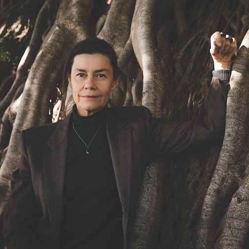
Erin Irwin
https://artcollector.net.au/wp-content/uploads/2021/11/Art-Collector-logos-transparency-WHITE-1080x1080px-2.png
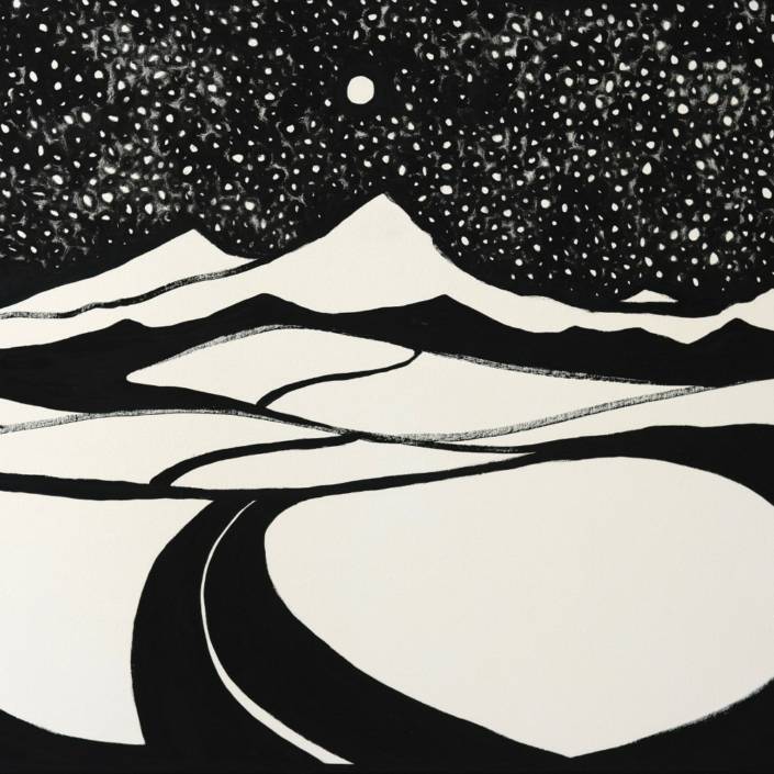
Erin Irwin2024-07-18 07:37:442024-07-18 07:38:03Artist Profile: Arryn Snowball
https://artcollector.net.au/wp-content/uploads/2024/07/05-Road-to-the-mountains-DSCF8901-Online-crop-1.jpg
1000
1000
Erin Irwin
https://artcollector.net.au/wp-content/uploads/2021/11/Art-Collector-logos-transparency-WHITE-1080x1080px-2.png
Erin Irwin2024-07-18 07:37:442024-07-18 07:38:03Artist Profile: Arryn Snowball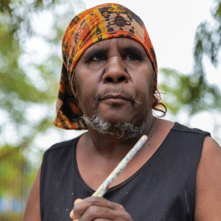 https://artcollector.net.au/wp-content/uploads/2024/07/CHAPMAN-Doreen-scaled.jpg
2560
2560
Erin Irwin
https://artcollector.net.au/wp-content/uploads/2021/11/Art-Collector-logos-transparency-WHITE-1080x1080px-2.png
Erin Irwin2024-07-18 07:17:452024-07-18 07:17:45Artist Profile: Doreen Chapman
https://artcollector.net.au/wp-content/uploads/2024/07/CHAPMAN-Doreen-scaled.jpg
2560
2560
Erin Irwin
https://artcollector.net.au/wp-content/uploads/2021/11/Art-Collector-logos-transparency-WHITE-1080x1080px-2.png
Erin Irwin2024-07-18 07:17:452024-07-18 07:17:45Artist Profile: Doreen Chapman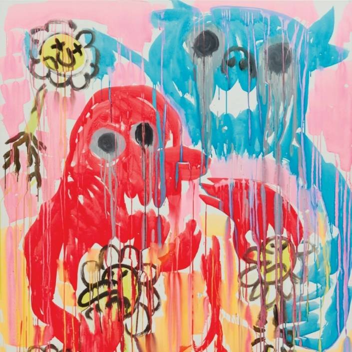 https://artcollector.net.au/wp-content/uploads/2024/07/JP1223_01-1.jpg
1000
1000
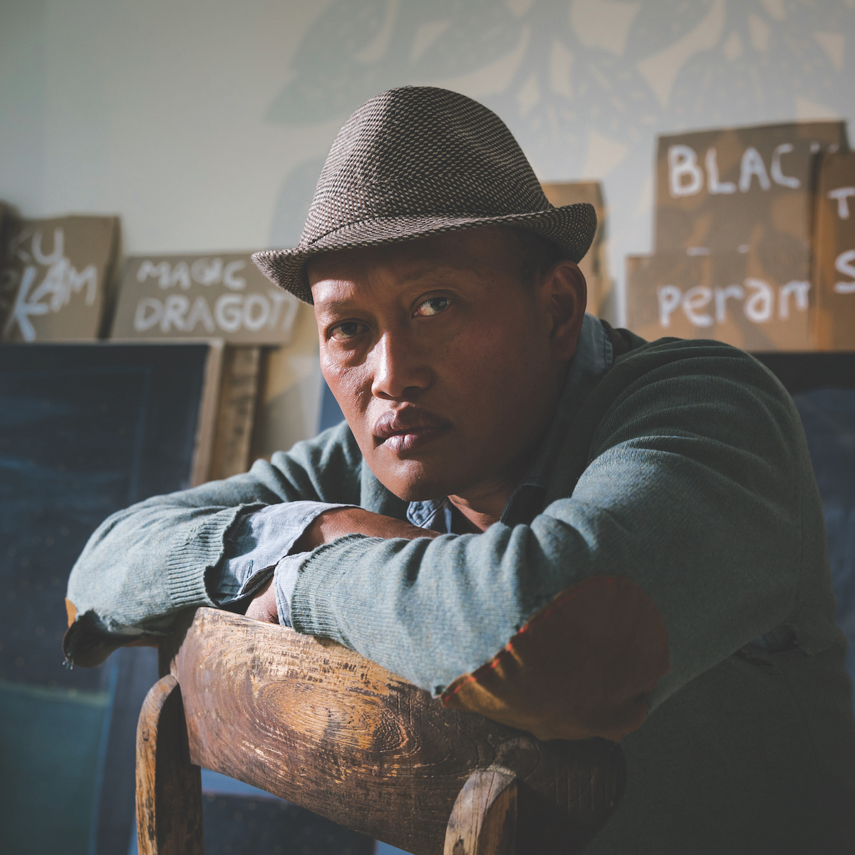
Erin Irwin
https://artcollector.net.au/wp-content/uploads/2021/11/Art-Collector-logos-transparency-WHITE-1080x1080px-2.png
Erin Irwin2024-07-17 08:28:552024-07-17 08:28:55Artist Profile: Jason Phu
https://artcollector.net.au/wp-content/uploads/2024/07/JP1223_01-1.jpg
1000
1000
Erin Irwin
https://artcollector.net.au/wp-content/uploads/2021/11/Art-Collector-logos-transparency-WHITE-1080x1080px-2.png
Erin Irwin2024-07-17 08:28:552024-07-17 08:28:55Artist Profile: Jason Phu https://artcollector.net.au/wp-content/uploads/2024/04/21A5554.jpg
1200
1200
Erin Irwin
https://artcollector.net.au/wp-content/uploads/2021/11/Art-Collector-logos-transparency-WHITE-1080x1080px-2.png
Erin Irwin2024-04-15 01:59:432024-07-18 06:51:32Artist Profile: Abdullah M. I. Syed
https://artcollector.net.au/wp-content/uploads/2024/04/21A5554.jpg
1200
1200
Erin Irwin
https://artcollector.net.au/wp-content/uploads/2021/11/Art-Collector-logos-transparency-WHITE-1080x1080px-2.png
Erin Irwin2024-04-15 01:59:432024-07-18 06:51:32Artist Profile: Abdullah M. I. Syed https://artcollector.net.au/wp-content/uploads/2024/04/AikoRobinson_AC_AaronClaringbold.jpg
1200
1200
Erin Irwin
https://artcollector.net.au/wp-content/uploads/2021/11/Art-Collector-logos-transparency-WHITE-1080x1080px-2.png
Erin Irwin2024-04-15 01:17:462024-07-18 07:08:12Artist Profile: Aiko Robinson
https://artcollector.net.au/wp-content/uploads/2024/04/AikoRobinson_AC_AaronClaringbold.jpg
1200
1200
Erin Irwin
https://artcollector.net.au/wp-content/uploads/2021/11/Art-Collector-logos-transparency-WHITE-1080x1080px-2.png
Erin Irwin2024-04-15 01:17:462024-07-18 07:08:12Artist Profile: Aiko Robinson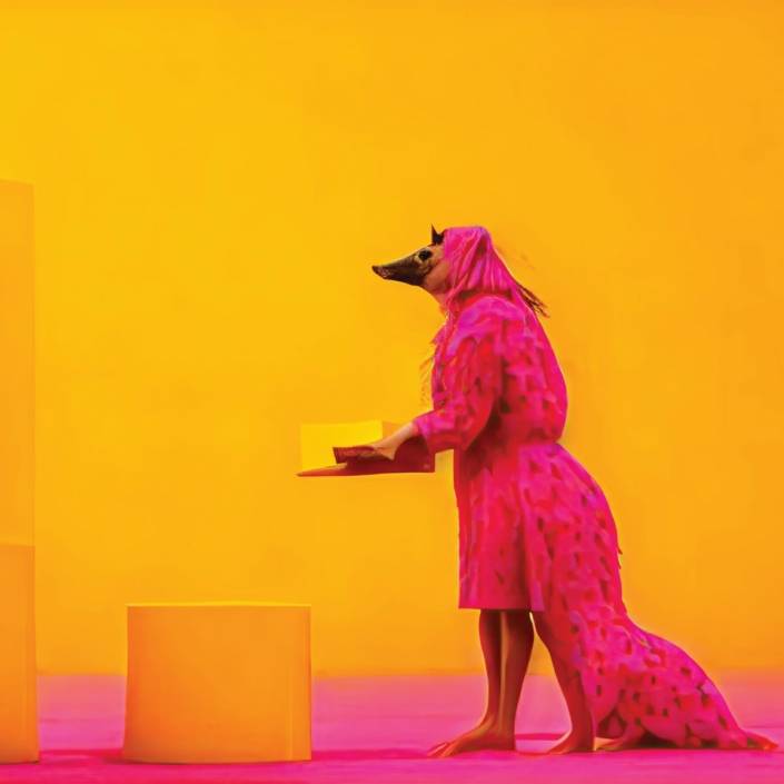 https://artcollector.net.au/wp-content/uploads/2024/04/BrieTRENERRY003.jpg
1200
1200
Erin Irwin
https://artcollector.net.au/wp-content/uploads/2021/11/Art-Collector-logos-transparency-WHITE-1080x1080px-2.png
Erin Irwin2024-04-03 08:26:292024-04-03 08:28:54Artist Profile: Brie Trenerry
https://artcollector.net.au/wp-content/uploads/2024/04/BrieTRENERRY003.jpg
1200
1200
Erin Irwin
https://artcollector.net.au/wp-content/uploads/2021/11/Art-Collector-logos-transparency-WHITE-1080x1080px-2.png
Erin Irwin2024-04-03 08:26:292024-04-03 08:28:54Artist Profile: Brie Trenerry
